Voice & Content
Confident, plainspoken techno-optimism. Big future claims delivered with a builder's matter-of-factness. Never breathless or salesy; conviction over hype.
- Person. "We" for the org/community ("We bring creators…"). "You" to address the reader and recruit ("This is for you", "Quit your job").
- Casing. ALL-CAPS squared display for headline statements and section labels (
WHAT IS IPÊ VILLAGE,WE'RE TECHNO-OPTIMISTS). Sentence case for body copy and value chips (Freedom of Speech). Title Case for proper nouns and program names (AI House,Founder Haus,Town Hall). - Punchy fragments, manifesto cadence. Short declaratives stacked for rhythm: "We are living in the future. And in the past at the same time."
- Concrete over abstract. Real names, dates, places, numbers:
April 6 – May 1, 2026,Jurerê Internacional, Florianópolis, Brazil,$10k+ in grants and prizes. - Vocabulary. techno-optimist, frontier tech, onchain, parallel institutions, network state, pop-up city, prototype, coordination, governance, decentralization, builders & operators.
- Bold within sentences to spotlight the key phrase: "…we bring together builders, founders, researchers, creators, and techno-optimists…"
- No emoji. Tone is set with type, color and the chevron mark.
Don't
- Neon/cyberpunk clichés
- "Revolutionary / disruptive" filler
- Exclamation spam, corporate hedging
- The "less X, more Y" / "we're not X, we're Y" antithesis pattern — state the positive claim directly instead
Do
- "We prototype the city of the future."
- "Quit your job. Prompt a new city."
- Core values as chips: Freedom of Speech · Economic Freedom · Privacy · Decentralization · Voluntary Coordination · Opt-in Systems · Openness · Prosperity
Color
Overall feel: clean, bright, optimistic and biophilic-futurist — sunlit greenhouse-city, not dark sci-fi. Lots of white space, crisp squared type, one electric green doing the heavy lifting.
Official brand palette
Extended palette (light/dark-first extensions)
Usage rules
- Lime
#A2D729is the brand. Solid banner fills, value chips, highlight marks, the icon mark. - Grass
#8DC50Afor green headline text on white — more legible than bright lime. - Blue
#3AA5FFis the secondary accent — info chips, checkmarks, links, the cooler end of the gradient. - Yellow
#FFB600is a sparing third accent. - Navy
#002642is overlay text only — laid over light gradient or photo backgrounds. Never a flat page background.
Backgrounds — priority order
- Light gradient (primary): lime → sky-blue, airy and luminous — often laid over a faded, desaturated grayscale photo of biophilic architecture. Text on these is navy or ink.
- Solid light: white, off-white
#F7F8F4, light-gray panels#EFF0EC. - Dark gradient (secondary): warm green-black → cool blue-black — not navy. Solid near-black
#0B0C0Aalso fine. - Never a flat navy-blue background. Navy is reserved for overlay text.
Gradients
Signature CSS gradients, plus official full-resolution gradient backdrops (3204×2302 PNG) for slides and covers.
--grad-light — primary. Airy lime → sky wash for hero blocks and covers. Navy/ink text on top.
--grad-lime-blue — full-strength lime→blue wash for banners and accents.
--grad-dark — secondary. Warm green-black → cool blue-black. White/lime text on top.
| Set | Files | Pair with |
|---|---|---|
| Light gradients (primary) | bg-light-01 · bg-light-02 · bg-light-03 · bg-light-04 | Navy logo, navy/ink text |
| Dark gradients (secondary) | bg-01 · bg-02 · bg-03 · bg-04 · bg-05 · bg-06 | White logo, light text |


- Use as full-bleed backgrounds for logo lockups and deck slides (titles, dividers).
- Watch contrast: add a subtle scrim behind text where needed.
- Photo treatment over gradients: desaturate to near-grayscale, low contrast, blend into the lime→blue wash so type stays readable.
- Do not stretch — crop to fill while preserving aspect.
Typography
Pairing logic: techno headline + calm grotesque body. Both faces are free on Google Fonts (DM Sans).
Prompt a new city.
| Role | Face | Weights | Notes |
|---|---|---|---|
| Display / headlines / labels / data | Chakra Petch | 300 · 500 · 700 | ALL-CAPS for headline statements; 0.18em tracking on small labels |
| Body / UI | DM Sans | 400 · 500 · 700 | Comfortable measure (~60ch); bold to spotlight key phrases |
Green (#8DC50A on light, #A2D729 on dark) is applied to headline words and inline mark highlights.
Logos & Marks
The "ıpê" logotype is bespoke — always use the supplied files, never re-set it in a font. Do not stretch, rotate, recolor, or add effects.
Lockups & wordmarks


The chevron — primary symbol
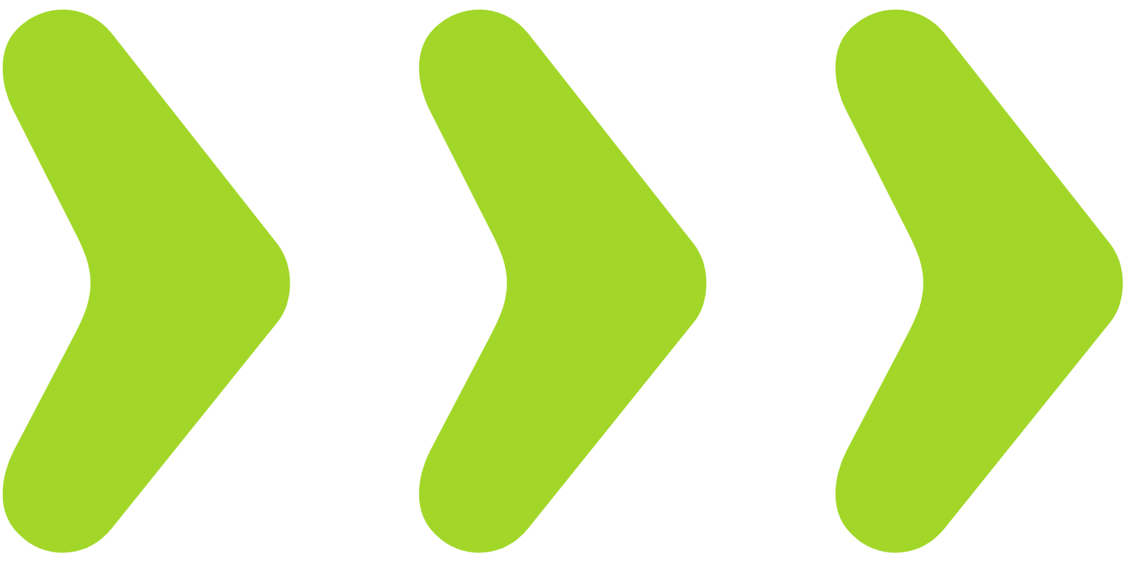
A single chunky, rounded upward chevron. Appears solo as an app/icon mark, and doubled/tripled pointing right (» ») as a directional "forward / let's go" motif in banners. Available in black, white, lime, navy, outline and gradient cuts.



Globe symbol
The triple-globe mark (three interlocking globe projections). Use as a secondary graphic device, not as the logo.


Imagery
The Architect — hero illustration
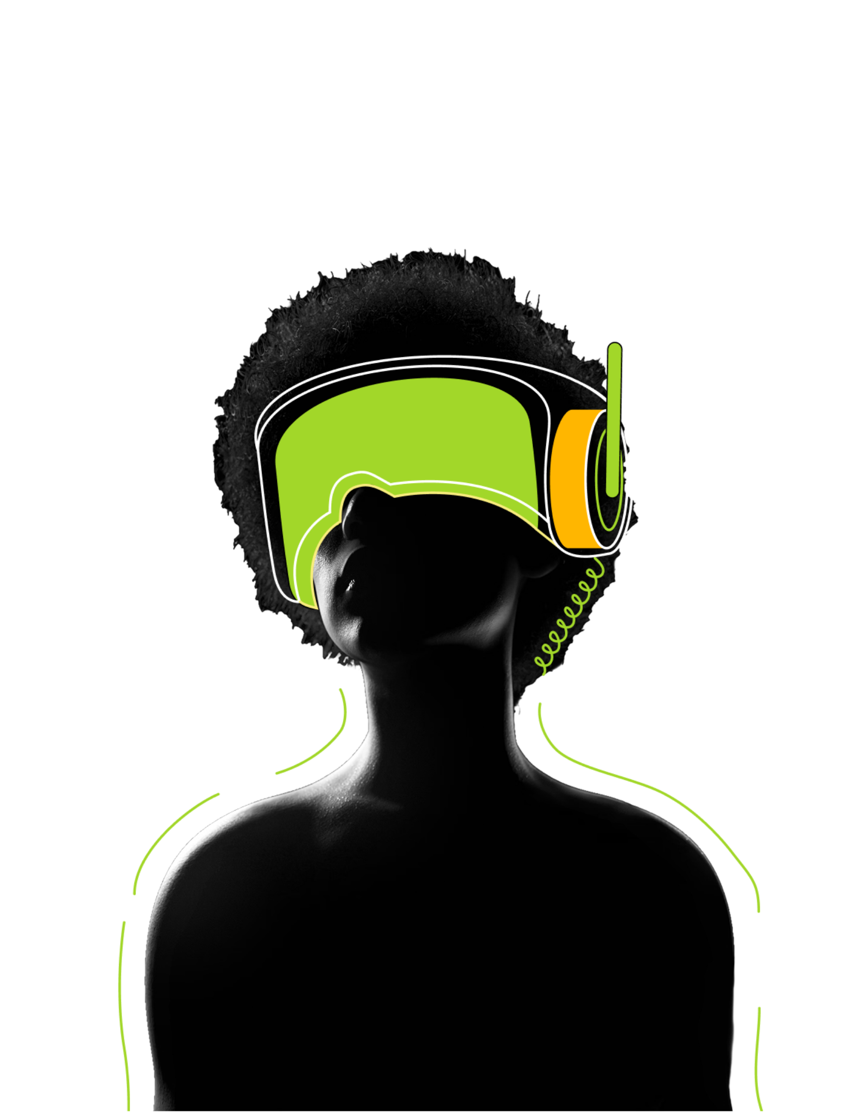
- Black silhouette wearing an oversized lime/orange AR/VR visor, fine "signal" strokes radiating out, lime accent lines tracing the body — the human-meets-frontier-tech motif.
- Place on a dark background; pair with lime and yellow text accents.
- Keep text minimal: one bold statement alongside it.
- Do not crop the radiating lines above the head; do not recolor or add filters.
Architecture & photo treatment
- Lush, plant-covered terraced buildings — warm daylight, green-dominant, realistic. Used full-bleed or as the faded base of light gradients.
- Photos over gradients: desaturated to near-grayscale, low contrast, blended into the lime→blue wash so type stays readable. Cool-to-warm but always bright.
Layout
- Generous white space; strong left-alignment; a visible modular grid (thin registration lines as decoration).
- Big type anchors the top-left; supporting copy in a comfortable measure (~60ch).
Shape, Borders & Shadows
- Crisp, near-square. Value/info chips and banners are rectangular with a tiny
2–4pxradius. Cards use a soft12–18pxradius. Pills (999px) only for tags & avatars. - Cards: white surface, 1px hairline border
#E2E4E0, soft neutral shadow0 8px 24px rgba(13,13,13,.08)— no colored glows, no colored left-border accents. - Borders: hairline neutral, or a 2px ink border for emphasis (buttons, focus).
- Shadows: soft, low, neutral gray; elevation via blur+offset only. On dark surfaces a deeper
rgba(0,0,0,.45)lift. No neon glow, no inner-shadow skeuomorphism. - Transparency & blur: sparing — light gradient washes over photos, occasional frosted panel. Default is solid and clean.
| Token | Value | Use |
|---|---|---|
--radius-xs | 2px | Chips, banners, marks |
--radius-sm | 4px | Small controls |
--radius-md | 8px | Buttons, inputs |
--radius-lg / --radius-xl | 12px / 18px | Cards, containers |
--radius-pill | 999px | Tags & avatars only |
| Spacing scale | 4 · 8 · 12 · 16 · 24 · 32 · 48 · 64 · 96 px | 4px base grid |
| Containers | 1200px / 760px | Page / narrow measure |
Iconography
- Primary mark: the Ipê chevron (see Logos & Marks).
- Decorative dots: a tiny
◎ ◎ ◎target/aperture trio as a light divider accent on date lines and section ornaments. - UI icons: the brand has no proprietary icon font — use Lucide (even ~1.75px stroke, rounded joins, geometric build). Ink by default; lime/blue when active.
- Program/category icons: a Lucide glyph in white on a blue or amber rounded-square tile.
- No emoji. No unicode-as-icon hacks.
Data & Charts
- Categorical order: lime
#A2D729→ grass#8DC50A→ sky#3AA5FF→ amber#FFB600. For a single quantitative comparison (ranked bars), stay one hue (lime); reserve a second hue only to flag one item. - Bars & tracks: filled bar is lime; empty track is
#EFF0ECwith a near-square corner. Value labels in mono, grass-deep on light. - Big numbers / stats: display font — grass on light surfaces, lime on dark. Pair with a small mono/body label.
- Tables: hairline dividers,
#EFF0ECheader row,#F7F8F4zebra, first column in the display font; wrap in a 12px-radius container withoverflow:hidden. - Maps: use world-dark.svg / world-light.svg. Markers are lime dots with a soft lime ring, placed as HTML overlays — not baked into the SVG. On dark, fade the map toward the text side with a gradient scrim.
- Diagram markers: the hero point is a lime dot; secondary points are neutral gray.


Motion & States
- Calm and confident — short fades & slides (
120–220ms), easingcubic-bezier(.22,.61,.36,1). No bounce, no infinite loops. - Hover: lime fills go slightly brighter; ink/ghost buttons gain a faint tint; cards lift one shadow step.
- Press: subtle darken + ~1px nudge (no large scale-shrink).
- Focus: 3px soft blue ring.
Asset Index
All URLs are relative to https://ipe.city and are direct download links. A machine-readable markdown companion lives at /brand.md; deck templates at /deck (spec: /deck.md).
| Asset | URL | Notes |
|---|---|---|
| Lockup — navy / light | /branding/ipe-lockup-navy.svg · /branding/ipe-lockup-light.svg | SVG; PNG also available (.png) |
| Wordmark — dark / light | /branding/ipe-wordmark-dark.svg · /branding/ipe-wordmark-light.svg | SVG + PNG |
| Logo — black / light | /logo-black.svg · /logo-light.svg | SVG + PNG |
| Chevron marks | /branding/chevron-{black,white,lime,navy,gradient,outline,stack}.png · /branding/chevron.svg | Primary symbol |
| Globe symbol | /branding/symbol-navy.svg · /branding/symbol-white.svg | Triple-globe mark |
| The Architect | /branding/the-architect.png | Hero illustration, dark bg only |
| Dark gradients | /branding/bg-01.png … /branding/bg-06.png | 3204×2302 |
| Light gradients | /branding/bg-light-01.png … /branding/bg-light-04.png | 3204×2302 |
| Visual elements | /branding/visual-globe-sphere.svg · /branding/visual-heads.svg · /branding/visual-globe-triple.svg · /branding/visual-layers.png · /branding/visual-map-sc.svg (each with -dark variant) | Line-art motifs |
| World maps | /branding/world-dark.svg · /branding/world-light.svg | Ipê-styled outline world map (CC BY-SA 3.0 — Al MacDonald / F. Lekschas; attribution embedded) |
| Fonts | Chakra Petch · DM Sans | Google Fonts CDN |